In October this year the Australian Bureau of Statistics released a second round of data from the 2016 Census. This data included responses to the Method of Travel to Work question, providing insights to bicycle commuting numbers. I started to look at this data and was concerned by what I saw. What follows is a graphical presentation of some Census data, confronted against the results of the 2017 National Cycling Participation Survey and Cycling Australia licence numbers. A picture of Australian cycling numbers emerges, across transport, recreation and competition. It’s an uneven picture that poses some difficult questions.
The Census of Population and Housing – Method of Travel to Work
The Census is a point in time snapshot for the date of August 9 and the travel to work question (MTWP) specifically asks ‘How did the person get to work on Tuesday, 9 August 2016?’ (my emphasis) The mission of the ABS is to ‘inform Australia’s important decisions’ and a question on usual travel to work methods might be more helpful in this respect. But I suspect most people who usually commute by bike will say they did in their Census response, even if that day was a wash out and we caught the train …
You can see some info on the question here. Notably the respondent can select multiple methods of transport. For example, they might ride or drive to the train station and then complete their journey by public transport. Most respondents take a single method and the ABS only provides bicycle data for single method transport. So all the charts that follow represent single method commuters. I’m excluding a statistically insignificant but non-zero number of riders who start or finish their commute by bike.
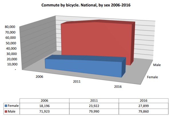
First the overall numbers, for the nation, over the last three Censuses:
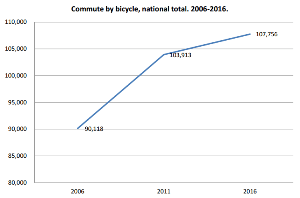
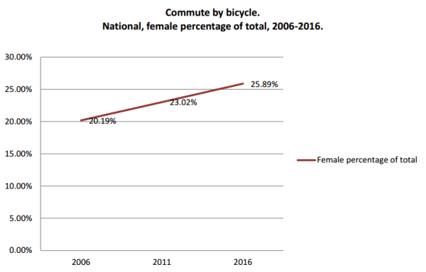
Small progress right? Well, let’s look at those numbers as a percentage of total single method commutes:
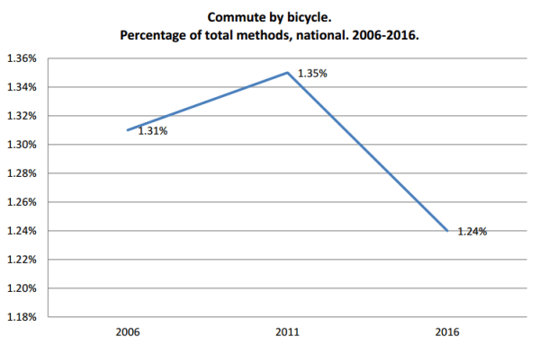
These changes take place in a broader statistical context which warrants analysis. The ABS released a cursory overview of methods comparing 2016 and 2011 (note some growth in train commuting). You could go much further to see what percentage each transport method constitutes of the total over time and how this relates to population growth in specific geographies etc. But for this post I’m going to stick with bikes – you can follow the links if you want to dig deeper.
Ok … a pie chart for fun:
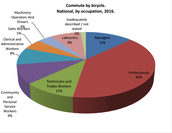
So there’s a correlation between certain walks of life and propensity to ride to work. 50 years ago I suspect commuting by bike would have had blue-collar connotations; no longer.
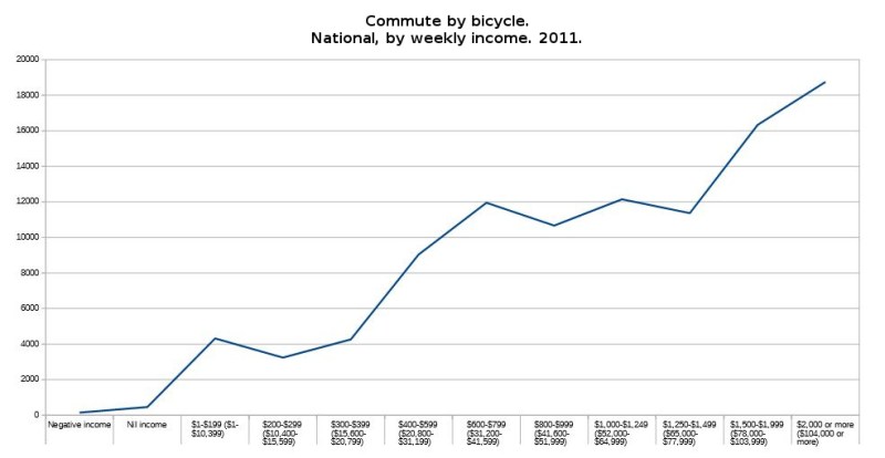
I accessed the 2016 MTWP data using the Community Profiles search page.The more powerful Table Builder tool, which enables you to compare different types of data, didn’t have the 2016 MTWP loaded at the time of writing. But I used Table Builder to run bicycle commute numbers against income categories for 2011 and found the more you earn the more likely you are to ride. I expected there might be a sweet spot above which people ride less, but it just goes up and up:
So with the 2016 MTWP data not yet loaded into Table Builder, I took the numbers from the 2016 Community Profiles, and ran Table Builder separately for 2006 and 2011 Census data to make the following time series:
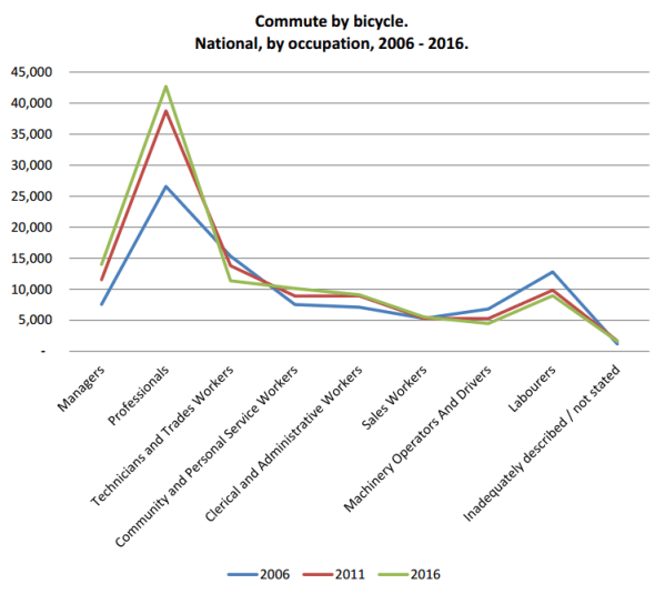
Here we have the same occupation categories as above, this time covering the last three Censuses. A big jump in bicycle commuting amongst professionals at 2011 and continued growth at 2016 but that green line dives down below the previous years amongst tradies and other blue-collar categories. Preponderantly, and increasingly, the bicycle commuter is a white-collar worker.
Recently, some controversy has emerged around female participation in cycling commuting, especially in Melbourne. In a troubling piece on the Age one writer suggested a figure of less than twenty percent and implied this was symptomatic of a broader cultural problem. Without getting into that right now (and not to dismiss her experience or concerns at all) let’s look at the actual numbers.
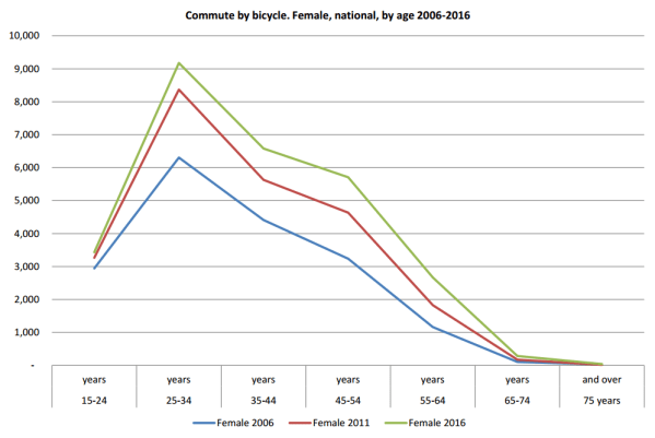
Here are the national female participation numbers by age group since 2006.
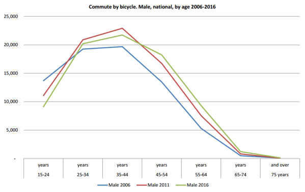
Here are the equivalent male numbers:
And just so you don’t have to scroll between the two, here are the female and male numbers together.
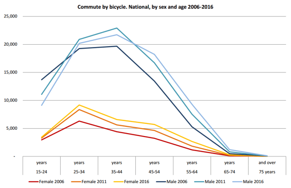
Yes, considerably more men than women commute by bicycle. But there is a story here. Female numbers are increasing every year in every category. Male numbers have dropped sharply in the 15-24 age category and have fallen from their 2011 high in the 25-34 and 35-44 year categories.
What might have happened in 2011 to make cycling popular amongst men in these categories? I couldn’t plug in to Table Builder: MTWP, by age, by gender, by Cadel Evans Tour de France results – but I have a hunch! (census night was 9 August 2011, Cadel won the Tour on 24 July 2011)
Here’s a couple of other ways of looking at that:
The overall number of male commuter cyclists has actually declined since 2011. That means women are responsible for the entire growth in the national total depicted above. The decline of the total number of men also means we can’t simply point to car usage tied to outer urban growth and say it’s only relative decline. For some reason guys have been hanging up their cleats.
Cycling to work remains a majority male activity, however it is becoming more feminine.
So, some concerns at the national level, but Melbourne is a cycling utopia right? Declared in 2011 by the UCI as only the second ‘Bike City’ in the world, after Copenhagen?
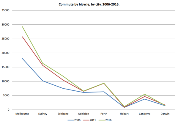
Well, let’s have a look at the cities:
Note: I’m using the GCSSA geographical standard from 2011 and 2016 city boundaries. This wasn’t available in the 2006 Census so I’m using the SD standard for that year which has very similar boundaries. The differences would be statistically insignificant for our purposes.
For total number or riders Melbourne is far and away the leading Australian city for riding to work. Melbourne is starkly ahead of the more populous Sydney and shows a steady growth trend which is also visible for Canberra.
Things look worse for Sydney, and worse still for Adelaide, if we look at what percentage of total transport methods cycling constitutes, with both cities going backwards:

Darwin’s figures look a bit drastic but bare in mind this percentage is based on very low totals in that small city. Melbourne, Brisbane and Hobart are the year on year success stories in this view.
Looking at the female percentage of bicycle commuters by city, we see some of the same trends noted above:

The numbers are growing each year. A South Australian friend suggested Adelaide’s overall rider numbers have declined due to an epidemic of aggressive driving. If this is the case Adelaide’s women aren’t cowed, showing an increase covering the best part of five percent between 2011 and 2016. Similarly Brisbane shows impressive growth in this view. And for the record, Melbourne’s women bike commuters make up closer to 30% than the recently mentioned number below 20%.
You could cut the data up in so many ways. It’s all there on the ABS site, available to you for free to wade through and analyse to your heart’s content!
National Cycling Participation Survey
So how does the ABS data, which specifically relates to travelling to work, compare to other cycling participation data?
As part of the commonwealth government’s National Cycling Strategy, the National Cycling Participation Survey (NCPS) has been run biennially since 2011. This survey aims to determine a broad picture of cycling participation, not limited to commuting (though the survey does usefully distinguish between cycling for transport and recreation). Unlike the Census, which questions everyone, the survey targets a sample of over 4,000 households and almost 10,000 individuals. That’s enough to ensure a statistically meaningful result.
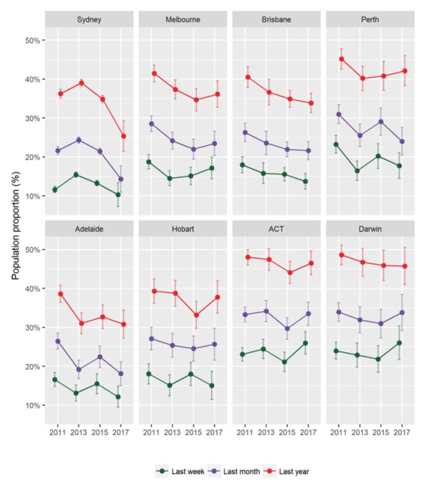
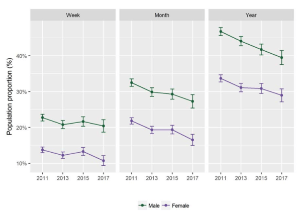
The survey determines if the respondent rode in the previous week, month, or year, and what purpose she or he rode for. The latest results are concerning.
The percentage of the population riding at all:

Note, I’ve simply taken a screenshot of the relevant NCPS charts here from the PDF which is available for free (with registration) via: https://www.onlinepublications.austroads.com.au/items/AP-C91-17
Looking at the same metric by city, Sydney has real problems:
Who would have thought having a hostile state government, roads minister and driver culture could have such a dissuasive effect?
As the survey began in 2011 we can’t know if that was an unusually good year. Referring back to the Census data we can see men between 25-44 did reach a high point in commute numbers that year. As much as I joke about the Cadel effect, that achievement might have inspired a few people to give riding a temporary go, causing a bounce in the trend line.
Participation by gender shows the same trend, with male participation declining more steadily than female year on year:
A final chart from the NCPS shows the breakdown of transport versus recreation.
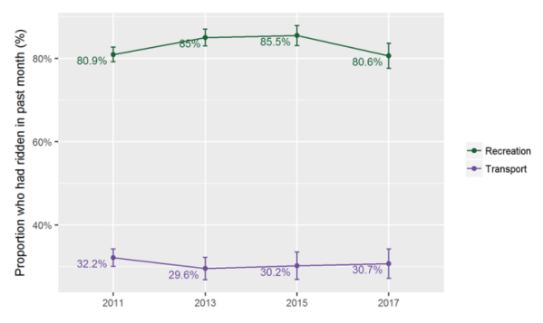
Cycling remains a preponderantly recreational pursuit in Australia. This points towards my last source of data for this post.
Cycling Australia licence numbers.
If you’re one of the small number of people who subscribe to this blog, chances are you have a Cycling Australia (CA) licence, or know someone who does. But have you ever thought to read the annual reports of CA? Until I wrote this post I hadn’t, and it occurs to me that that’s a problem.
We pay CA hundreds of dollars each year to race and don’t get much of a say. Admittedly the vast majority of CA’s funding comes from government, but I feel we should still play a role in holding them to account and a little knowledge is a good starting point to that end. All the annual reports are available online back to 2010, though the older ones require a linkedin account to download. I just screen-grabbed those and entered the numbers into Excel manually.
Let’s start with total licence numbers:
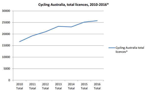
* Excludes ‘Affiliates’ region category, which did not have data for each licence category and ‘Others’ licence category which treated temporary memberships inconsistently across reports.
For the last three annual reports CA have given a gender breakdown. It’s not really enough data to go on just yet, but perhaps it shows some cause for hope:
Looking at the total licence numbers by State and Territory gave me a huge surprise:
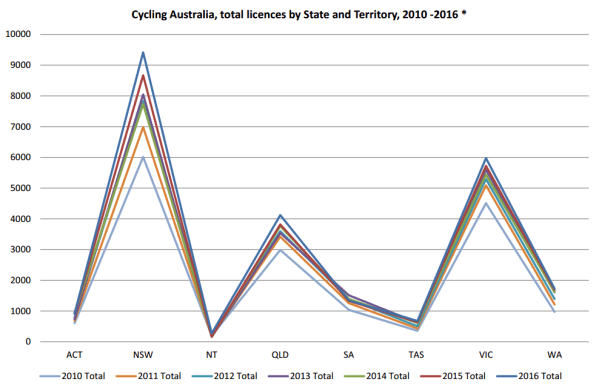
Is this track racing in NSW? Or active regional centres? It certainly flies in the face of Sydney’s very poor reputation as a cycling city.
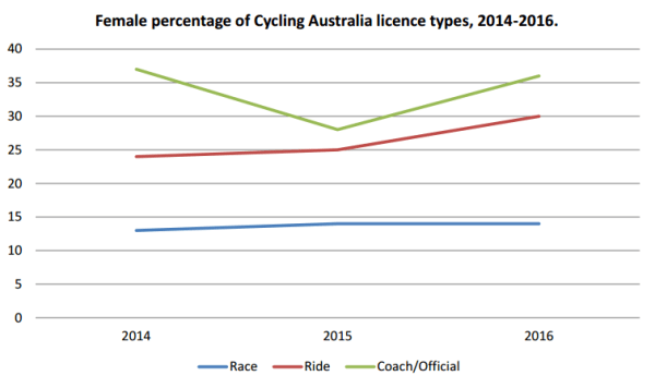
But the most meaningful data I could assemble and present from the CA reports was the following time series by licence-type. Here I’ve included the numbers which I assume will be interesting to anyone with a race licence:
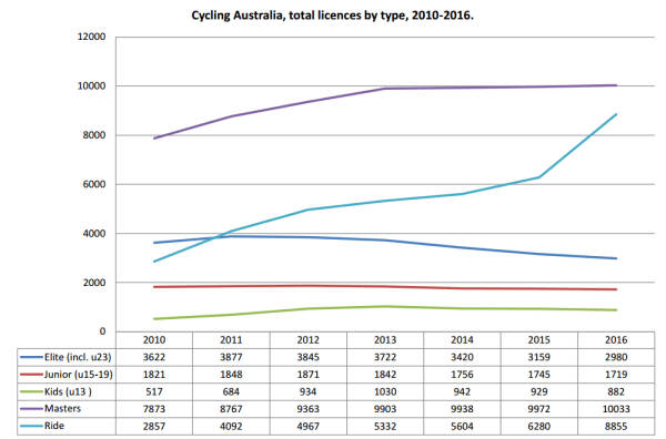
Uses 2016 licence categories, previous age categories have been grouped accordingly.
Despite growth in overall licence numbers, race licences are in decline. A bare growth in masters racing is outweighed by the disappearance of almost 1000 elite (under 30) racers since 2011. The overall licence growth has come from the successful promotion of ‘ride licences.’ So good for the coffers of CA but not so good for the sport? At a time when the body is de-prioritising road for track, I think there is reason to be concerned.
The big picture.
In many aspects Australian cycling is in decline, especially amongst young men, fewer of whom are racing and commuting. There are some glimmers of hope. Some cities look better than others, more women are riding (or fewer than men are stopping), and an increasing number of people are seeing the benefits of becoming involved with cycling clubs (via CA membership) even if not in order to race.
I find the worst of this hard to believe. Before I sat down to look at the numbers I assumed I was part of a burgeoning lifestyle, where more people recognised the health benefits of riding and the joy of connection a bicycle can give you. This is a feeling of connection to people, to nature, and even to the simple beauty of the machine itself; a bicycle is like a machine for breaking down alienation. Surely this is a thing of unstoppable attraction?
I assumed that all the conflict and antipathy we face on the roads and elsewhere was simply teething trouble that evidenced our growth. But what does it mean if this conflict is accompanying our decline?
If you’ve read this far and you have any thoughts, please share them below. Because it looks like we have to do something.


